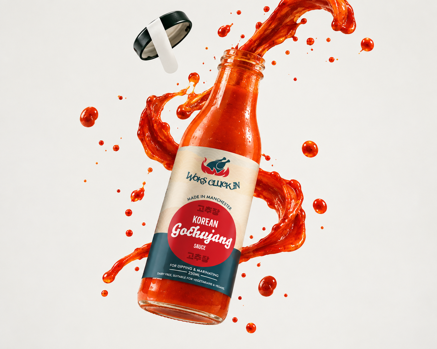
Make it stand out.
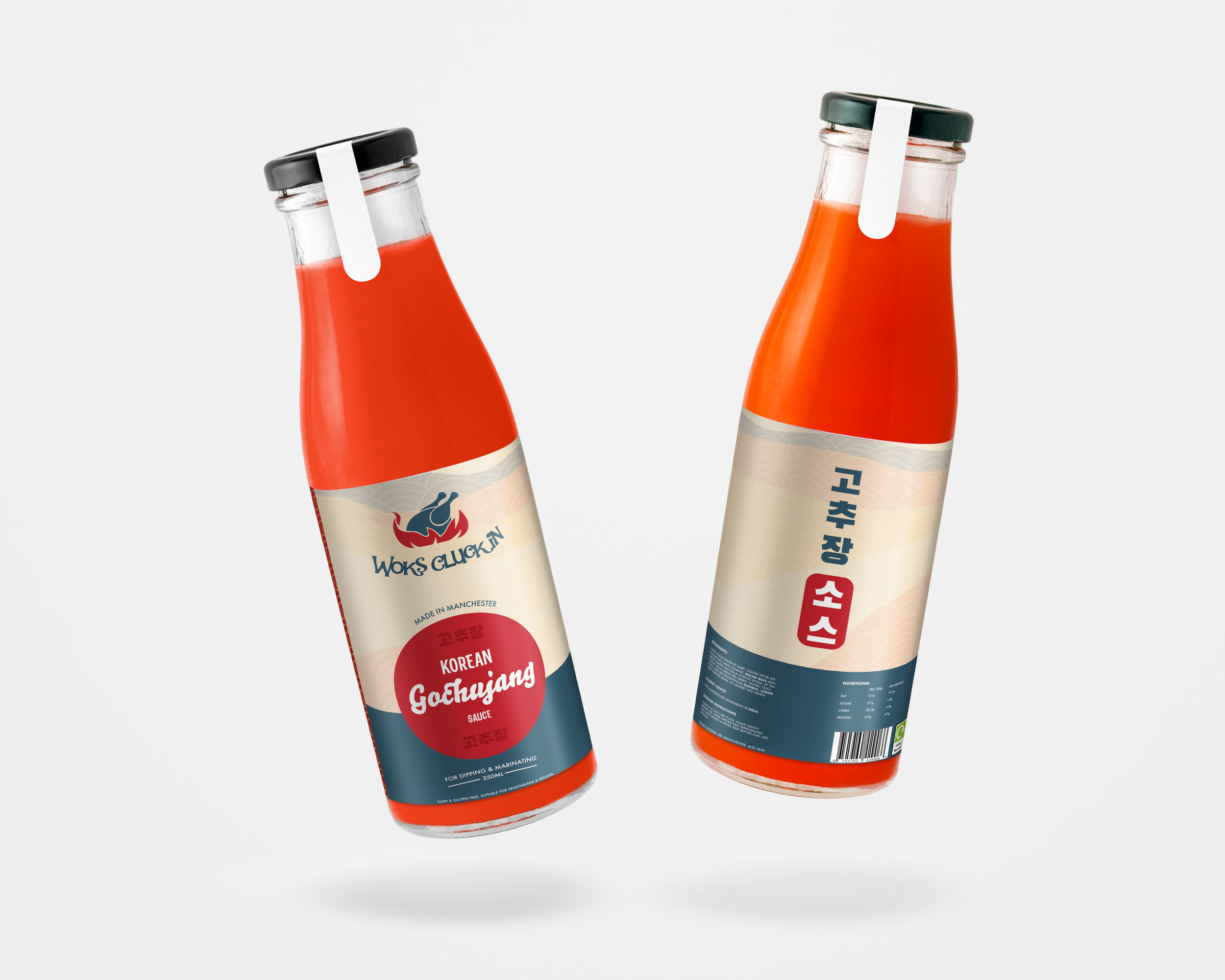
I created the visual identity and packaging design for Woks Cluckin’s Korean Gochujang Sauce, taking the project from the initial label concept through to a finished, shelf-ready product. I developed a bold visual style inspired by Korean design, combining the wave pattern, red and deep blue colour palette, Korean typography and the Woks Cluckin branding to create something that felt distinctive while still working as part of the wider brand.
From Screen to Shelf
The project also involved working directly with the client and a third-party printing company to make sure the design translated properly from a digital artwork into a physical product. I prepared the label artwork to the printer’s specifications, worked through revisions and print requirements, and communicated between the printer and client throughout the process. This meant considering things like sizing, layout, colour and how the artwork would actually sit around the bottle, rather than designing purely for screen.
The final labels were printed and applied to the bottles, creating a finished product that is now used and sold at the Woks Cluckin restaurant. It was a great example of taking a design beyond a portfolio mockup and seeing it through to something that exists as a real-world product.